Ever wondered how to turn raw location data into stunning visual insights? Have you ever looked at a table full of data and wished you could see the patterns and trends more clearly? Well, with Tableau, you can transform those rows and columns into compelling visual stories. In this blog post and accompanying video, we’ll walk you through the process of creating an interactive heat map in Tableau using data exported from a WISER history file, allowing you to easily identify areas of high or low activity.
What is Tableau and What is a Heat Map?
Tableau is a powerful data visualization tool known for its user-friendly interface and ability to create interactive dashboards. By combining data from a WISER history file with Tableau’s visualization capabilities, you can gain valuable insights into past incidents, identify recurring locations, or analyze response patterns.
A heat map is a graphical representation of data where values are depicted by color. This visual approach makes it incredibly easy to quickly grasp the distribution and intensity of data across different categories or geographical areas.
It is an excellent way to visualize location data, revealing patterns and movements in a clear, interactive format. This example uses location data collected from Roomba vacuums, tracked via the WISER System, and the process used applies to any WISER location tracking data. By the end, you’ll have the tools to see how your assets or devices move around your arena.
What You’ll Need
- Tableau Desktop
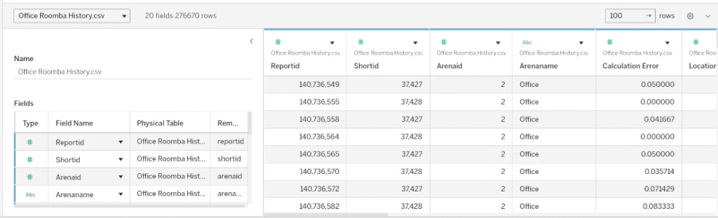
- WISER history data exported as a CSV file (including columns like Location X, Location Y, and Short ID)
- A floorplan image (with known pixel dimensions)
- Andy Kerfonta (You can definitely do it yourself, but Andy is very good at this)
Step 1: Import Your WISER Data
Open Tableau and import your WISER history data as a CSV file. You’ll see a preview of the data, including all columns such as Location X, Location Y, and Short ID.
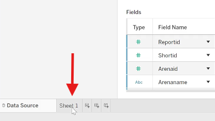
Step 2: Navigate to the Worksheet
Once the data is loaded, switch to a new worksheet in Tableau. All your data columns will appear in the Data pane on the left.
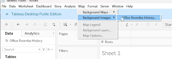
Step 3: Add a Background Image (Floorplan)
To overlay your heat map on a floorplan, add a background image.
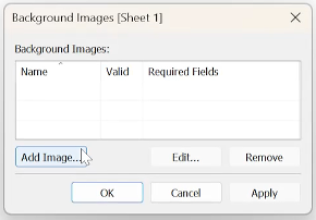
Go to Map > Background Images and select your data source.
Open your floor plan image file.
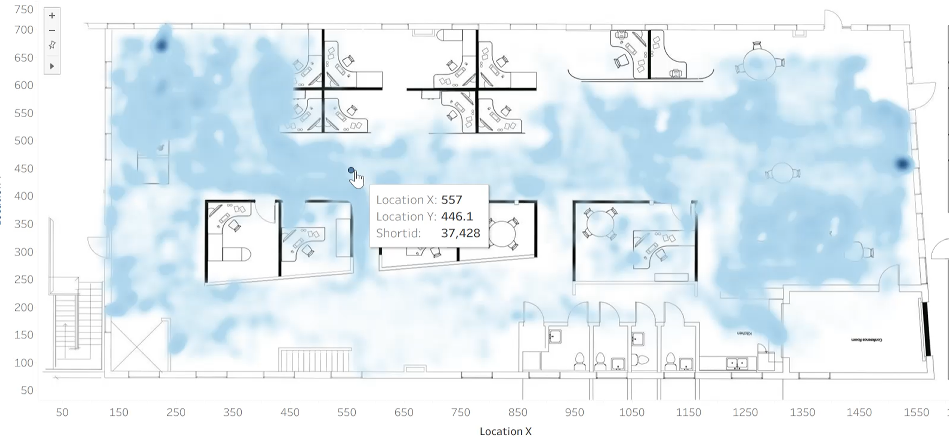
Set the X field to “Location X” with a range from 0 to the image’s width in pixels (e.g., 2337). Set the Y field to “Location Y” with a range from 0 to the image’s height in pixels (e.g., 760). These values come from your image size and the inches-per-pixel scale set in WISER for your location data.
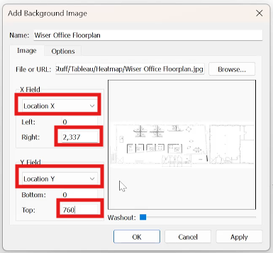
Note: The image won’t appear until you add data to the view.
Step 4: Plot Location Data
Drag the “Location X” label to the Columns field input.
Drag the “Location Y” label to the Rows field input.
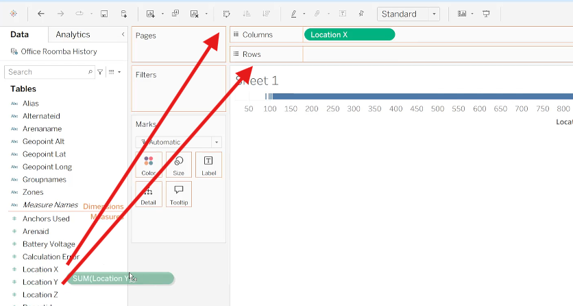
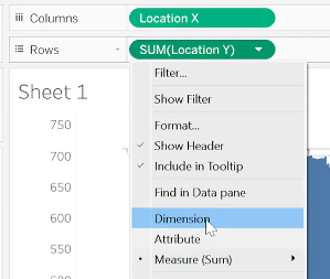
Change both from a measure (sum) to a dimension by right-clicking the “Location” Green Pill element and selecting Dimension.
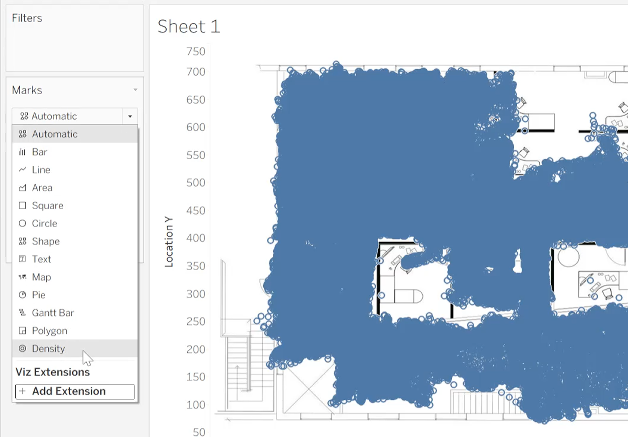
Your floor plan image should now appear, with data points plotted over it. At this stage, it might look scattered, but you’ll see patterns emerging.
Step 5: Convert to a Heat Map
To turn the points into a heat map, go to the Marks card and change the mark type from Automatic to Density. This creates a color-gradient heat map showing data density.
Step 6: Add Details for Interactivity
Drag “Shortid” to the Detail Button on the Marks card.
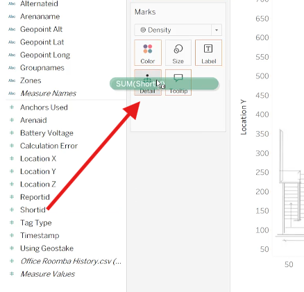
Right-click it and change it to Attribute and ensure it is Discrete.
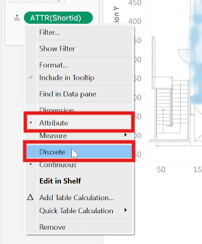
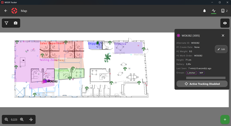
This allows you to hover over areas in the heat map to see specific details, like which WISER Tag (by Short ID) was in that location.
Step 7: Customize the Heat Map
Adjust the heat map for better visualization at the Marks card:
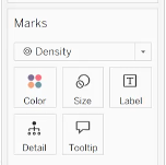
- Use the Size Button-slider to change dot sizes and see how it affects the density view.
- Edit colors via the Color Button to make the heat map more intuitive.
- Add filters, labels, or other measures as needed to refine insights or to analyze the data based on different criteria (e.g., date range).
Final Thoughts
Creating a heat map in Tableau using WISER history file data is a powerful way to unlock valuable insights from your information. By following these steps, you can transform raw data into visually compelling stories that can inform decision-making and improve understanding of past events.
If you are interested in talking with someone from WISER about how we can help at your facility, please feel free to reach out. You can contact us via our website, email, or phone.